Mobile-first indexing is the standard practice by which major search engines predominantly use the mobile version of a site’s content for indexing and ranking. This represents a fundamental shift in how search works, moving the focus from the desktop experience to the mobile experience. Understanding the deep implications of mobile-first indexing is no longer optional for SEO success; it is the absolute baseline. This guide provides the key insights that every webmaster, marketer, and business owner must know to thrive in this mobile-centric reality.
The transition to a mobile-first world is complete. For years, the desktop version of a website was considered its “real” version, with the mobile site often being a secondary, sometimes limited, alternative. Mobile-first indexing has inverted this model entirely. Now, a website’s mobile version is its primary identity in the eyes of search engines. A failure to grasp this concept can lead to significant and often confusing issues with search performance. The following sections will provide a deep dive into what this change means, its critical implications, and how to optimize for it effectively.
What is Mobile-First Indexing? A Definitive Explanation
To navigate the modern SEO landscape, a precise understanding of mobile-first indexing is essential. It is not just another ranking factor; it is the very foundation of how a website is seen and evaluated by search engines.
The Old Way: Desktop-First Indexing
Historically, search engines used their desktop crawler as the primary agent for discovering and evaluating web content. The desktop version of a website was the one that was crawled, its content was used to populate the search index, and its signals were used to determine rankings. The mobile version, if it existed, was considered an “alternate” version.
The New Standard: The Mobile Version is Primary
Mobile-first indexing completely reverses this. Now, the search engine’s mobile crawler, the smartphone googlebot, is the primary crawler for the vast majority of the web. This means:
- The mobile version of a site is what gets crawled most frequently.
- The content and links on the mobile version are what the search engine uses to understand the page and add it to its index.
- The performance, user experience, and technical signals of the mobile version are the primary ones used to determine a page’s ranking for all searches, both mobile and desktop.
What Mobile-First Indexing is NOT
There are several common misconceptions about mobile-first indexing that are important to clarify.
- It is not a separate “mobile index.” There is still only one single search index. Mobile-first indexing simply refers to the fact that the mobile version of a page is what is used to populate that single index.
- It does not mean “mobile-only.” The desktop version of a site still exists and is important for desktop users. However, it is no longer the primary version from the search engine’s perspective.
- It is not just another ranking factor. It is a fundamental change in the indexing process itself.
The “Why”: The Inevitable Shift to a Mobile World
The move to mobile-first indexing was not an arbitrary decision by search engines. It was a necessary and logical response to a massive and irreversible shift in user behavior.
The Explosion of Mobile Search
Over the past decade, the smartphone has become the primary device for accessing the internet for a majority of users worldwide. This led to a situation where most searches were being conducted on mobile devices.
The Problem of Mismatched Content
Before mobile-first indexing, a significant problem emerged. Search engines were indexing the desktop version of a page, which was often comprehensive and complete. However, when a mobile user clicked on that search result, they were often sent to a separate, “m-dot” mobile version of the page that had a stripped-down, limited set of content. This created a frustrating user experience, as the content the search engine had promised was not actually on the page the user landed on.
Aligning the Index with User Reality
Mobile-first indexing was the solution to this problem. By making the mobile version of the page the primary source for the index, search engines ensured that what they were indexing and ranking was the same content that the majority of their users would actually see. It aligned the search index with the reality of a mobile-first world.
The Critical Implications of Mobile-First Indexing
The shift to mobile-first indexing has several profound and non-negotiable implications for website owners. A failure to adapt to these new realities can be devastating for a site’s search visibility.
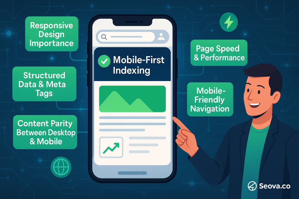
- Content Parity is King: The single most important implication. The content on the mobile version must be the same as the desktop version.
- Mobile Page Speed is Primary: The performance signals from the mobile site are what matter most.
- Mobile UX is a Direct SEO Concern: The user experience on the mobile version is a direct ranking consideration.
- Structured Data Must Be on Mobile: All schema markup must be present on the mobile version.
- Meta Data Must Be on Mobile: All important tags, like titles and descriptions, must be identical.
Implication #1: Content Parity is King
This is the most critical takeaway. Since the mobile version is the one being indexed, any content that is only present on the desktop version will not be seen by the primary crawler and will not be considered for ranking. This means that all important text, images, videos, and links must be present and visible on the mobile version of a page. Hiding content behind “read more” buttons that do not load the content in the HTML can also be problematic for javascript seo.
Implication #2: Mobile Page Speed is a Primary Ranking Factor
A site’s performance and page speed signals are now judged based on the mobile version. This includes the Core Web Vitals metrics (LCP, INP, CLS). A fast desktop site with a slow mobile site will be judged as a slow site. Therefore, optimizing for mobile page speed is a top priority in any modern technical seo strategy.
Implication #3: Mobile UX is a Direct SEO Concern
The overall user experience of the mobile site is a direct input into the ranking algorithms. This includes factors like the readability of the text, the size and spacing of tap targets (like buttons and links), and the absence of intrusive pop-ups. A poor mobile user experience is a negative quality signal. A comprehensive mobile seo strategy is therefore essential.
Implication #4: Structured Data Must Be on the Mobile Version
Structured data, or schema markup, must be present on the mobile version of the site to be processed by search engines. If a site has different HTML for its desktop and mobile versions, it is a common mistake to only include the structured data on the desktop version. This will cause it to be missed by the mobile-first crawler.
Implication #5: All Meta Data Must Be on the Mobile Version
Similarly, all other important on-page SEO elements must be present and identical on the mobile version. This includes title tags, meta descriptions, canonical tags, and hreflang tags. The mobile version must be a complete and fully optimized representation of the page.
A Checklist for Mobile-First Indexing Success
Optimizing for mobile-first indexing involves a systematic review of a site’s mobile experience. The following checklist covers the most critical areas to address.
Implement a Responsive Web Design
The easiest and most reliable way to ensure a site is ready for mobile-first indexing is to use a responsive web design. This approach uses the same URL and the same HTML code for both desktop and mobile, and simply uses CSS to change how the page is displayed on different screen sizes. This inherently solves the problem of content parity.
Ensure Content is Fully Visible and Accessible
Whether a site is responsive or uses a different mobile configuration, it is essential to ensure that all important content is visible and accessible on the mobile version. Avoid hiding content in a way that requires a user interaction to load it. All content should be present in the rendered HTML of the mobile page.
Audit Your Internal Linking Structure on Mobile
The internal linking structure that the mobile crawler sees is the one that will be used to understand the site’s architecture and to pass authority. It is crucial to ensure that the navigation and internal links on the mobile version are as comprehensive as on the desktop version. A failure to do so can lead to the creation of orphan pages that are not discoverable by the mobile crawler.
Verify Your Robots.txt and Meta Robots Rules
It is a critical error to have a robots txt file that blocks the mobile crawler from accessing important resources, such as CSS, JavaScript, or images. The mobile crawler needs access to all these resources to properly render the page.
How to Check Your Status and Monitor Performance
It is important for webmasters to verify their site’s status and to continuously monitor its mobile performance. The best tool for this is Google Search Console.
Using Google Search Console
In the “Settings” section of Google Search Console, a webmaster can see the “Crawling” information for their property. This will clearly state whether the primary crawler is the “Smartphone” bot or the “Desktop” bot. For nearly all sites today, this will be the smartphone bot. The URL Inspection Tool is also invaluable. It allows a webmaster to enter any URL from their site and see how Google’s smartphone bot renders the page.
The Mobile Usability Report
The Mobile Usability report in Google Search Console is a key diagnostic tool. It will flag any URLs on the site that have mobile usability issues, such as text that is too small, or clickable elements that are too close together.
The Importance of Mobile Crawl Stats
For large websites, monitoring the crawl stats for the smartphone bot is a key part of managing the site’s crawl budget. This can help to identify if the crawler is spending too much time on low-value sections of the site. This is a core part of any enterprise technical seo effort.
Embracing the Mobile-First Reality
Mobile-first indexing is not a future trend to prepare for; it is the fundamental reality of the present. A website’s mobile version is its definitive identity in the eyes of the world’s largest search engines. A successful SEO strategy must therefore be a mobile-first strategy. By embracing this reality and focusing on creating a mobile experience that is fast, complete, and user-friendly, businesses are not just optimizing for a specific device. They are building a resilient foundation that is aligned with the behavior of modern users and the trajectory of the entire web.
Frequently Asked Questions About Mobile-First Indexing
What is mobile-first indexing?
Mobile-first indexing is the process where search engines like Google predominantly use the mobile version of a website’s content for indexing and ranking. It means the mobile site is the “primary” version.
Has my site been switched to mobile-first indexing?
Yes, for all intents and purposes, the entire web has been moved to mobile-first indexing. It is the standard for all websites.
How do I optimize for mobile-first indexing?
You optimize for it by ensuring that your mobile website is a complete and high-quality experience. The most important factor is to have content parity, meaning your mobile site has all the same content as your desktop site. A responsive design is the best way to achieve this.
Does mobile-first indexing mean desktop is not important?
No, the desktop experience is still important for your desktop users. However, from an SEO perspective, the mobile version is what will determine your rankings for both mobile and desktop searches.
What is content parity?
Content parity is the principle that the mobile version of your website should contain all the same content—text, images, videos, and links—as the desktop version. A lack of content parity is a major issue in a mobile-first world. For a complete list of pages, a well-formed sitemap is key, and there are many sitemap examples to follow. For more general advice, you can review some popular seo tips.